Canalblog
Suivre ce blog Administration + Créer mon blog

palimpsests & other things

21 mars 2015

Charles Robinson by Jim Vadeboncoeur

Charles Robinson - The Happy Prince  tumblr_lzzc9qZlYJ1rotwfko1_500
Charles Robinson represents the struggle within me for preference of media. Do I like the pen and ink more than the watercolors or vice versa? I still don't know the answer. One minute I'm sure it's the watercolors, but then I see one of his elegant, languid, almost Art Nouveau pen drawings and I'm confused again. Then I'm certain, at least until I see another sumptuous watercolor and the mental debate is resumed. was born in 1870. His father was an illustrator and his grandfather engraved the work of illustrators for the burgeoning magazine and newspaper market of the mid 1800's. His older brother, Thomas Heath Robinson, was an illustrator as was William Heath Robinson, his younger brother. Talent ran deep in the family, and all three brothers were raised in an atmosphere that guided them towards their final profession.

After a childhood of assimilating his father's (and his uncle's) craft, and a high school education, Charles was apprenticed to a printer where he worked the lithographic stones. For the seven years of his indenture, he did his best to take art lessons in the evenings. His studies were sufficient enough to earn him a probationary berth at the Royal Academy in 1892, but finances kept him from taking advantage of it. Apprentices didn't make much money and the fortunes of his family must have been affected seriously by the revolutions occurring in the printing and reproduction fields.

By the 1890's a new type of artist had appeared to take advantage of the new technology. Robinson's grandfather had made a living by engraving the drawings of other artists onto wood so that the resulting blocks could be incorporated with the metal type to be inked and pressed against paper to make multiple copies of newspapers, magazines and books. The "drawings" of the artist were never seen, only the engraved version. His father drew for this type of reproduction and adjusted his designs to facilitate their translation by the engraver. As Charles Robinson grew up, so did the infant technique of photographic reproduction. Artists of his generation were the first to be able to present their art to the public directly as drawn. The engravers weren't happy, but the artists were ecstatic and their stylistic variations exploded in the '90s. Images by Beardsley, Abbey, and Crane were reproduced as the artists had drawn them, and the influence of those styles spread and Robinson was exposed to them all.

It wasn't until he was 25 that Charles began to make professional sales. His first full book was Robert Louis Stevenson's A Child's Garden of Verses (1895) and it's filled with over 100 pen & ink drawings that display many different facets of a talented artist turned loose to play. As usual, ornate pen and ink and the internet are not that compatible, but the image above left should give you one small sample of the exuberance and playfulness of the images. The publisher was John Lane of The Bodley Head and he gave Robinson free hand with the design of the book. It was exceedingly well received, going through innumerable printings and generating many other commissions.

Children's magazines were proliferating and provided an ever-growing demand for illustration. Golden Sunbeams, started in 1896, is a particularly rich source of his work for the first dozen issues.

He wasn't the only Robinson getting work, either. Golden Sunbeams featured art by Tom and William as well, and in 1899 the three brothers combined their efforts and styles on a version of Andersen's Fairy Tales. Charles' cover (above right) is an Art Nouveau design reminiscent of Bilibin or Margaret Armstrong. His fascination with cherubs and angels was to be life-long and he would incorporate them into hundreds of designs.

Robinson illustrated lots of fairy tales and children's books throughout his career. Another John Lane publication, Lilliput Lyrics, also in 1899, featured a frontispiece (at left) and title page done in lithographic color. His years as an apprentice served him in good stead and I wouldn't be surprised if he worked the stones himself.

Just to make it clear (maybe) what I'm talking about, perhaps a short aside is necessary. Before the advent of color-separated photo reproduction techniques, color was applied to printed images though the mechanism of lithography. A large stone resided at the print shop and each color was delineated by an artist with a grease pencil. The stone was then covered with water and then with an oil-based ink. The grease pencil repelled the water and created a receptive surface for the ink. After a page was printed with a color, the stone would be wiped clean, ground down, and prepared for the next color. As you can imagine, registration was a significant problem. Ten to 20 colors were not uncommon. That's one reason why color plate books prior to the 1880's were (and are) uncommon. It wasn't easy, nor was it cheap.

Many of Robinson's early efforts were enhanced by the effective application of mechanical tones (grays) and an additional color. This can be seen in such titles as The Big Book Book of Fairy Tales and The Big Book of Nursery Rhymes.

Like his A Child's Garden of Verses, many of his early books feature numerous pen & ink drawings, with lists of illustrations that span several pages. The True Annals of Fairy Land: The Reign of King Herla (1900), for instance, has 82 images listed on five pages followed by the notation "Also numerous head and tail pieces." The aforementioned Big Book of Nursery Rhymes (1903) is over 300 pages and most of them have more than one drawing per page. The small vignette, the cherub with a flowing robe tailing off toward the bottom of the page, the billowing clouds, the fine, sinuous line often contrasted in the next image with a sure and powerful composition in black (as seen in the intricately bordered sailing image from King Herla, above right) - all are aspects of his pen and ink work that continue to fascinate me. The pure joy depicted therein is a constant source of additional pleasure. But then there are his watercolors...

The watercolors are astounding. Rich, subtle, ethereal - brilliant gems of tones and textures that reward repeated viewing with surprising treasures.

Charles Robinson - Once On a Time Charles Robinson - Big Book of Nursery Rhymes  Charles Robinson - The Sensitive Plant 

The early 20th century was a golden age of book publishing. Photo-mechanical reproduction was bringing life-like color to books for children and adults. Gift books abounded. There was a monthly publication called The Bookman that issued an annual each year at Christmastime. It would feature colorful inserts from the best books of the year. Each issue was over 1/2" thick. All the publishers would advertise their new books for the season, often with a list of all the titles they had available. The numbers are staggering. The opportunities for artists were never better and would never be as good again.

Charles Robinson was obviously enthralled with the idea of the "gift book." Rather than drawing and painting pictures to put alongside an author's text, Robinson approached the task as creating a book that was a gift - with the illustrated equivilent of colorful wrappings and shiny ribbons. He designed the entire book and even those featuring an abundance of tipped-in color plates were not spared his enchanting pen & ink drawings and his intricate gilt-embossed cover designs. And he was prolific, often producing six or seven books a year until WWI. Some classics that he illustrated include: Lullaby Land (1897), Sintram and His Companions (1900), Alice's Adventures in Wonderland (1907), Grimm's Fairy Tales (1910), The Secret Garden (1911), and many books written by W. Copeland, W. Jerrold, and himself.

After the war, he was one of the few artists of the Golden Age who continued to produce regular illustrated editions, albeit at a much reduced frequency. Above right is the frontispiece to A.A. Milne's Once On A Timefrom 1922.

Robinson was also an active painter, especially in his later life. Below is A Bit of Jade, a 12"x11" watercolor that was submitted and exhibited at the Royal Institute of Painters in Water-Colours (the RI, to which he was elected in 1932). It's the back cover to The Brothers Robinson, an indispensible publication by Chris Beetles. 240 pages and more than twice that number of illustrations, many in color.

Charles Robinson - A Bit of Jade

Robinson lived an unpretentious, normal life, admired and loved by family and friends. He died unexpectedly in 1937. He was 66.

Fantasy - The Golden Age of Fantastic Illustration, Brigid Peppin, 1975 Watson Guptill

Charles Robinson, Leo de Freitas, 1976 Academy/St. Martins 

The Fantastic Paintings of Charles and William Heath Robinson, ed. David Larkin, 1976 Peacock Press/Bantam

The Dictionary of British Book Illustrators and Caricaturists 1800-1914, Simon Houfe, 1978 Antique Collectors' Club

The Brothers Robinson, Geoffrey Beare, 1992 Chris Beetles Ltd

The Vadeboncoeur Collection of Knowledge, Jim Vadeboncoeur, Jr. 1998


to learn more: www.bpib.com/illustra.htm

Publicité
Publicité
21 mars 2015

The master enchanters, an article from Telegaph, November 2007

charles_robinson_picture_book   The Nightingale, Edmund Dulac

At the turn of the 20th century, a new generation of artist-illustrators brought fresh life to the written word and captured the public’s imagination. Rodney Engen’s book and exhibition, produced in association with the Dulwich Picture Gallery, explores the magic 

Just as communications dominate the 21st century, the growth of various means of printed communication greatly influenced 1890s Britain. In particular the growth of the popular illustrated press, the use of ambitious advertising methods, the rise of the poster as art form, the illustrated literary magazine, followed by the more mainstream colour illustrated gift book. 

All of these, nurtured by new printing technologies, helped to propagate a new aesthetic as well as establish the careers of many of the artist-illustrators. The British middle classes were hungry for novelty and sophistication and, however ephemeral or unusual the productions, they had the money to sustain them. 

When the illustrator Aubrey Beardsley edited the Yellow Book, the short-lived scandalous literary magazine, the initial print run of 7,000 copies quickly sold out. The editorial reflected Beardsley’s belief that his task was to shock a complacent public, as ‘the grotesque is the only alternative to insipid commonplace’. 

A major figure in the publishing world of the 1890s was the enterprising publisher John Lane of the Bodley Head. He eventually held the undisputed position as the man who made decadence pay. 

As the publisher of Beardsley, Oscar Wilde and many artist-illustrators, he had an astute eye for new talent and was a master of promotion. Noted for fanning the flames of controversy by publishing daring authors’ works in rarefied limited editions, he sought to promote an air of exclusivity that appealed to a sophisticated readership. 

Lane’s authors and designers developed their distinctive approaches by, among other influences further afield, emulating the French – it had been said that English decadence took its inspiration from ‘the poisonous honey of France’. They gathered in the cafes of London and Paris to exchange ideas and learn of the newest influences and movements. 

Japan had been an artistic magnet since it had been opened up to Western trade in 1853; by the 1870s, when the Arts and Crafts movement’s bold, stark furniture designs emerged, it was clear the designers had embraced the minimal Oriental approach as a new and exciting direction. 

The 20th century brought a hunger for colour, escapism and especially the infectious delights of the exotic to help people forget the terrible horrors of the First World War. The highly lucrative children’s market also grew: William Nicholson’s classic, The Un-Common Cat, which had gone into numerous editions in the previous century, was dismembered and framed to decorate the nurseries of the Empire well into the 20th century; a second more lavish edition was then sold to the nation’s doting parents, or what the Art Journal called ‘children of a larger growth’. 

Publishers capitalised on the change in their market. They beefed up their production and offered books of lavish colour plates, like the elaborately produced editions of Rudyard Kipling’s Jungle Book. Dense black-and-white wood engravings of the 19th century gave way to the three-colour printing process that soon revolutionised the illustrated book market.

In fact, this ingenious technical process was derived from the half-tone printing of black-and-white images first perfected as long ago as 1882, but only put into general use for colour work two decades or so later. 

Artists became household names, their annual illustrated books eagerly awaited and issued in expensive, lavishly bound, limited collectors’ editions, signed by the artist, and a less expensive trade edition, which often sold in its thousands. The illustrated gift book was indeed big business. Moreover, the artists often sold their original artwork at the specially themed publicity exhibitions in London’s Bond Street, which gave them an extra income and helped boost their fame. 

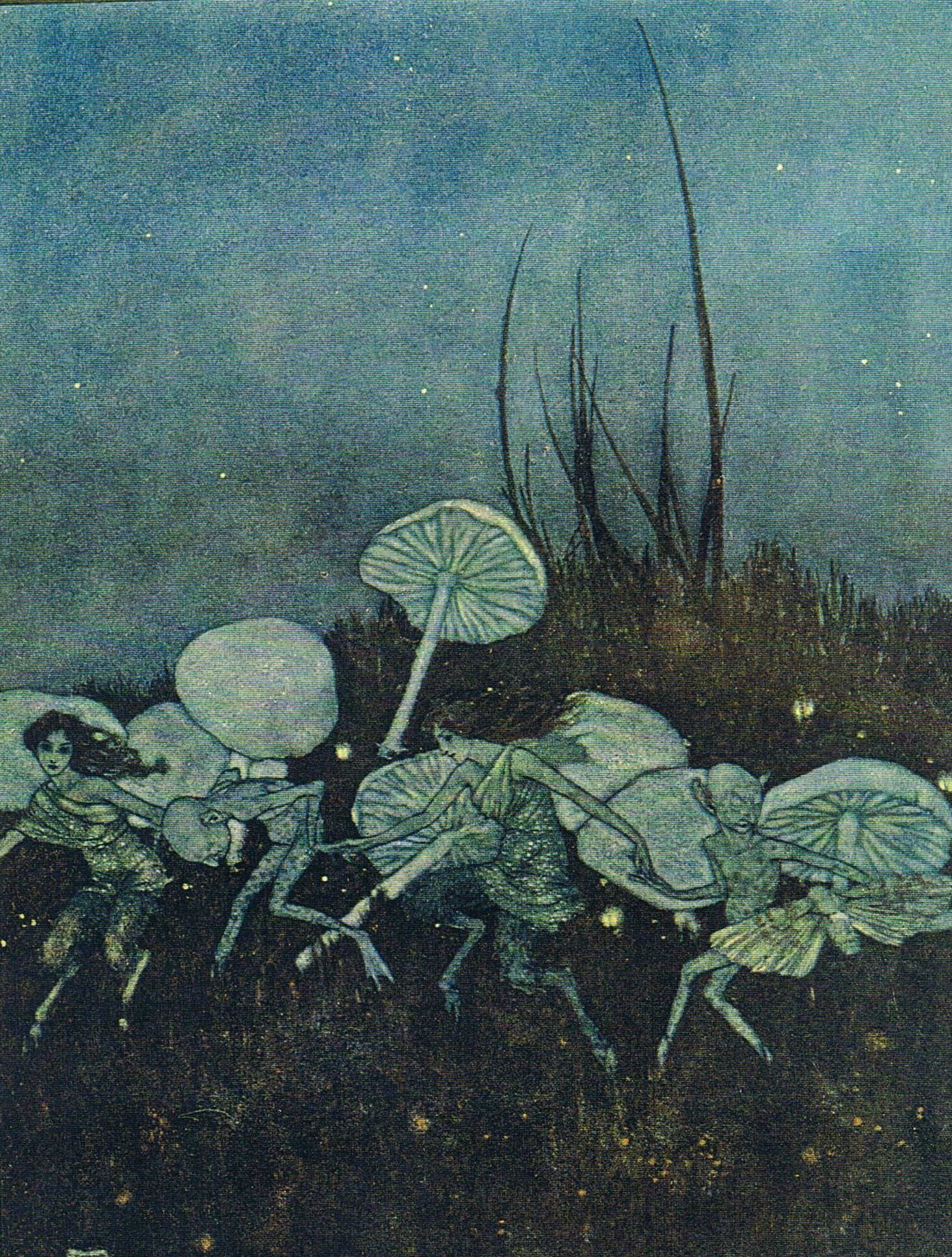
For many children as well as adults, fantasy meant fairies. Their ethereal world at the bottom of the garden provided a rich and satisfying means of escapism. ‘I used to half believe in and wholly play with fairies when I was a child,’ a mature Beatrix Potter recalled. 

She confided in her journal how the archetypal images of fairies and fairyland greatly inspired artists of her generation: ‘I cannot tell what possesses me with the fancy that they laugh and clap their hands, especially the little ones that grow in troops and rings amongst dead leaves in the woods. I suppose it is the fairy rings, the myriads of fairy fungi that start into life in autumn woods.’ 

With the rise of the wealthy Edwardian middle classes came a yearning for an escape from the effects of industrialisation and the urban sprawl that accompanied it. Many felt that the growth of the suburbs that encircled the cities and spread into the landscape greatly threatened the true English countryside. 

Enterprising publishers viewed this new ruralist marketplace as an untapped treasure, a rich seam from which to produce well-illustrated escapist volumes inspired by the beauty of Mother Nature for a jaded urban public.

It is not surprising that when Kenneth Grahame first published The Wind in the Willows in 1908, a misguided Times book critic, obviously hoping for more naturalist accuracy, dismissed the tale as ultimately disappointing because ‘as a contribution to natural history the book is negligible’. 

Clearly there was a real thirst for natural knowledge, however superficial, and if a book could inspire, especially with illustrations celebrating the beauty of nature, then there was a ready market for it. 

AUBREY BEARDSLEY 
(1872-1898) Since Aubrey Beardsley’s career lasted a mere six years – he died from tuberculosis at the age of 25 – his huge influence is all the more remarkable. His work is aligned to his youthfulness, especially his rebel-like regard for the shocking and an obsessive attraction to the prurient. Wholly self-taught, he found inspiration in such diverse pictorial influences as Japanese print, the work of the children’s book illustrator Kate Greenaway, the Italian Renaissance artists Mantegna and Botticelli, and his champion, the artist Edward Burne-Jones. 

It was his biographer, working 10 years after his death, who pierced the veil of secrecy surrounding the artist’s working methods. ‘He sketched everything in pencil, at first covering the paper with apparent scrawls, constantly rubbed out and blocked in again, until the whole surface became raddled from pencil, India rubber and knife: over this incoherent surface he worked in Chinese ink with a gold pen… so every drawing was invented, built up and completed on the same sheet of paper.’ 

In the work he later produced from 1895-98, Beardsley experimented with pencil shading and wash to accommodate the photoengraver that produced intricate masterpieces and spawned a devoted school of artistic disciples. 

Among Beardsley’s outstanding achievements are covers for the literary magazine the Yellow Book, illustrations for Oscar Wilde’s Salome, drawings for Alexander Pope’s The Rape of the Lock and his masterpiece of classical eroticism for Aristophenes’s Lysistrata. Today, Beardsley is looked on as a true precursor of the Modern Age, a pioneering inventor of abstractionism. 

ARTHUR RACKHAM (1867-1939) 
One of the most successful book illustrators of the 20th century, Arthur Rackham created about 150 illustrated books, published 3,000 black-and-white and colour illustrations as well as painting in oil and watercolour for galleries. The Rackham style, with its grotesque trees and ghoulish creatures, the fairy tales of sylvan glades and classical maidens, have charmed, terrified and delighted generations of adults and children alike. 

While a clerk at the Westminster Fire Office, for eight years he attended evening classes at the Lambeth School of Art where he developed drawing skills. An early commission came from the publishers JM Dent to illustrate a new edition of The Ingoldsby Legends in black and white and colour. Other work soon followed, including illustrated editions of the Grimm fairy tales and Jonathan Swift’s Gulliver’s Travels. 

But it was with his 51 drawings for Rip Van Winkle that he achieved serious recognition. Illustrated volumes of the classic fairy tales Aesop’s Fables and Mother Goose followed, and with these two books his children’s market was secured. 

Rackham also turned his hand to adult themes, creating what is considered to be his masterpiece for Shakespeare’s A Midsummer Night’s Dream. His Wagnerian illustrations (The Rhinegold & the Valkyrie followed by Siegfried & the Twilight of the Gods) gave full rein to his mastery of atmosphere and ability to create a terrifying Gothic vision.

The Rackham gift book set a trend among publishers. Each beautifully presented volume was issued for maximum sales. Published three months before Christmas and accompanied by an exhibition and sale of the original drawings at the Leicester Galleries, London, the formula sold in its thousands. 

Rackham found inspiration in Albrecht Dürer’s woodcuts and the fantasies of Hieronymus Boschists, but he also kept a collection of the more grotesque caricatures of Honoré Daumier, which inspired his own fantastical haracterisations. 

His 50 colour plates of JM Barrie’s Peter Pan were a homage to this colour sense. The book sold 14,000 copies of the six shilling edition alone. Never a sympathiser of the fast-paced modern world, he abhorred inventions like photography, which threatened his career.


EDMUND DULAC (1882-1953) 

   dulac_beauty_destiny Edmund_Dulac_-_The_Garden_of_Paradise_-_Fairy_of_the_Garden_garment 32610

 A French-born polymath designer, Edmund Dulac was an artist of not only exotic illustrations, but also of postage stamps, posters, banknotes, bookplates, playing cards, tapestries, carpets and furniture. As a student at the Ecole des Beaux Arts, he was known as ‘l’Anglais’, for his obsessive love of everything English. He dressed constantly in tweeds and at the age of 22 he left France for England and became a British citizen seven years later. 

Dulac brought his own unique vision to the world of Art Deco, which had previously been dominated by a staunchly English narrative style, with its accent on clarity and most of all on a black-and-white line. Dulac loved to mix styles. He painted with exotic colours and created his own language, borrowing heavily from the Orient, the Near East and the abstract forms of Africa. 

His chief rival was Arthur Rackham, whose medieval palette contrasted with the Frenchman’s more colourful themes. In 1907 Dulac was commissioned to illustrate a new edition of stories from The Arabian Nights and it was this that secured his reputation as an inventive new force in publishing. This book gave Rackham an opportunity to indulge in the softness of the gleam of moonlight on stone, while his use of ultramarine, indigo and Prussian blue, mingled with purples and violets, brought to the illustrations the calm and mystery of Eastern nights. ‘He would have chosen some dream city of the Orient for his birthplace, a Persian princess for his mother and an artist of the Ming dynasty for his father,’ said an admirer at his first American exhibition. 

The Arabian Nights inaugurated a collaboration between Dulac, his publisher Hodder & Stoughton and the Leicester Galleries, London, that lasted for eight years. Exhibitions of the original illustrations were held, each based on the long-awaited annual gift book: The Arabian Nights were followed by The Tempest, The Rubaiyat of Omar Khayyam, Stories from Hans Andersen, The Bells and Other Poems by Edgar Allen Poe, Princess Badoura, Sinbad the Sailor and Other Stories, and Edmund Dulac’s Fairy Book. During his lifetime, his output of some 116 titles made him a household name throughout the world. 

Dulac was an expert revolver shot and dedicated musician who played the bamboo flute – which he made himself – with his nose. He loved dressing up all his life, especially in the Oriental costumes he designed for himself and his wife. 


KAY NIELSEN (1886-1957) 
One of the most influential émigré artists, Kay Nielsen was born in Copenhagen, the son of an actor who managed the Royal Copenhagen Theatre and a famous actress mother. Young Kay was tutored privately from the age of 12. His adoring mother had loved to read her son his native Danish folk tale and legends, and local Danish folklore came to dominate his illustrations. 

Nielsen earnestly believed that folk tales were essential to the lives of people of all ages and while they were often populated by the exotic and the bizarre, it was only in pure folk tales that man’s predicament could be effectively symbolised. 

At the age of 17, Nielsen left Denmark to study art at Paris’s prestigious Académie Julian. By this time, art students intent on commercial careers in illustration realised that the best opportunities for advancement lay in England. 

He arrived with a portfolio of largely black-and-white ink fantasy drawings he called ‘The Book of Death’, which he hoped to exhibit and sell. On the strength of this debut he was commissioned to illustrate tales by Sir Arthur Quiller-Couch, entitled In Powder and Crinoline. The book quickly secured his reputation as a talent to watch. 

Nielsen delighted in colourful exuberance, pattern and an Oriental inventiveness. His winning formula was derived from his folkloric background. Nielsen also borrowed from a love of early Italian painting, delicate Persian miniatures, and Indian and Chinese landscapes, which he mixed and borrowed in a process he called ‘artistic wandering’. 

From the French he derived a ‘fashion plate’ simplicity; Nielsen women were always expertly dressed in intricate confections similar to the period’s finest couturiers. 

The artist illustrated Hansel and Gretel: Stories from the Brothers Grimm, and worked on a series of lavish and mildly erotic gouache illustrations for a Danish translation of The Arabian Nights. Nielsen’s masterpiece is considered to be his colour plates that illustrate the Scandinavian folk tales compiled in East of the Sun and West of the Moon: Old Tales from the North. With this one work he established himself as a master of an international aesthetic more seductive, rarefied and appealing than any of his rivals. In later years, he emigrated to America where he worked for the Disney film studios on Fantasia. 

A recent champion claims that Nielsen did not merely offer an escape from the mindlessness of modern existence, but ‘finds the imagination can conceive of infinite possibility and grasp an alternative vision where hope remains undimmed’. 


CHARLES ROBINSON (1870-1937) 

  cr3    tumblr_mdgh72O2Lf1qkevp7o1_500

One of the period’s finest children’s illustrators, Charles Robinson was long associated with visions of cherubic children and their adoring mothers. A master at pen and ink and atmospheric watercolour, he was a prolific illustrator, his books sold in great numbers and offered strong competition to his peer Arthur Rackham.

Born into a large family of printer-craftsmen, the artists Thomas and William Heath Robinson were among his siblings. Although his brothers received full-time art education, due to financial restraints, Charles had to make do with evening classes. 

Robinson’s first and most important commission was for Robert Louis Stevenson’s A Child’s Garden of Verses, first published by John Lane in a limited edition of 150 copies. It was reprinted many times up until 1952, as the New York Bookman noted, Robinson ‘had depicted childhood in all its remoteness from grown-up land, in its heroic and fantastic imagining, in its long thoughts and short sight.’ 

The artist loved children (and eventually had six of his own). They gave Robinson his trademark style, the fearless child with thick wavy hair and rustic clothes. His public expected of him this graphic evocation of childhood played out by the innocent, and not so innocent. 

He produced lavish watercolour plates for a version of Percy Bysshe Shelley’s The Sensitive Plant and mixed a heady exoticism in the colour plates for an edition of Oscar Wilde’s The Happy Prince in 1913, but returned relentlessly to his proven market, that of his popular collections of fairy tales. 

Robinson was talented enough to borrow from the past, from the townscapes and Gothicism of Albrecht Dürer’s woodcuts, which he transformed into fairy kingdoms, and above all from Japanese prints with their spare spaces and bold flat colours and striking perspectives. 

On his brother’s death, William Heath Robinson eulogised, ‘There was always something of youth and being on holiday about Charles.’ 

A_YOUNG_PRINCESS_SAT_DOWN_BY_THE_SIDE_OF_A_SPRING_OF_COOL_WATER_1_G0633  B3931865607

  • The text and biographies are an edited and abridged extract from ‘The Age of Enchantment’ by Rodney Engen (Dulwich Picture Gallery/Scala Books, £25). 
  • The exhibition of the same name runs from November 28 to February 17, at the Dulwich Picture Gallery (dulwichpicturegallery.org.uk)
8 mars 2015

Taryn Simon, Jeu de Paume, Paris

Taryn Simon

Taryn Simon was born in New York in 1975. Her artistic medium consists of three integrated elements: photography, text, and graphic design.


Simon's Birds of the West Indies (2013-14) is a two-part body of work, whose title is taken from the definitive taxonomy of the same name by the American ornithologist James Bond. Ian Fleming, an active bird watcher, appropriated the author’s name for his novels now well-known protagonist. This co-opting of a name was the first in a series of substitutions and replacements that would become central to the construction of the Bond narrative. The first element of the work is a photographic inventory of the women, weapons and vehicles of James Bond films made over the past fifty years. The images comprise an index of interchangeable variables used in the production of fantasy. Testing the seductive surfaces of popular cinema, Simon continues her artistic process of revealing the hidden infrastructures of cultural constructs. In the second element of the work, Simon casts herself as the ornithologist James Bond, identifying, photographing, and classifying all the birds that appear within the 24 films comprising the James Bond franchise. The result is a taxonomy of birds not unlike the original Birds of the West Indies. In this case, the birds are categorized by locations both actual and fictional: Switzerland, Afghanistan, North Korea, as well as the mythical settings of Bond's missions, such as the Republic of Isthmus and SPECTRE Island. Simon's discoveries often occupy a liminal space between reality and fiction; they are confined within the fictional space of the James Bond universe and yet wholly separate from it.

The Picture Collection (2013) was inspired by the New York Public Library's picture archive, which contains 1.2 million prints, postcards, posters, and printed images. It is the largest circulating picture library in the world, organized according to a complex cataloging system of over 12,000 subject headings. Since its inception in 1915, it has been an important resource for writers, historians, artists, filmmakers, fashion designers, and advertising agencies. Diego Rivera, who made use of it for his legendary mural for Rockefeller Center, Man at the Crossroads (1934), noted how the scope of this picture collection might go on to shape contemporary visions of America. In this work, Simon highlights the impulse to archive and organize visual information, and points to the invisible hands behind seemingly neutral systems of image gathering. Simon sees this extensive archive of images as a precursor to Internet search engines. The Picture Collection was developed in response to the online database Image Atlas (2012), created by Simon with computer programmer Aaron Swartz. Image Atlas investigates cultural differences and similarities by indexing top image results for given search terms across local search engines throughout the world.

A Living Man Declared Dead and Other Chapters I-XVIII was produced over a four year period (2008-11) during which Simon travelled around the world researching and recording bloodlines and their related stories. In each of the eighteen “chapters” comprising the work, legacies of territory, power, religion and circumstance collide with psychological and physical inheritance. The subjects documented by Simon include victims of genocide in Bosnia, test rabbits infected with a lethal disease in Australia, the first woman to hijack an aircraft, and the living dead in India. Her collection is at once cohesive and arbitrary, mapping relations of chance, blood, and other components of fate.

Black Square (2006-2014) is an ongoing project in which Simon collects objects, documents, and individuals within a black field that has precisely the same measurements as Kazimir Malevich's 1915 Suprematist work of the same name. Contraband (2010) is an archive of global desires and perceived threats, encompassing 1,075 images of items that were detained or seized from passengers and mail entering the United States. An American Index of the Hidden and Unfamiliar(2007) depicts objects, sites, and spaces that are integral to America's foundation, mythology, or daily functionality, but remain inaccessible or unknown to most Americans. These subjects include radioactive capsules at a nuclear waste storage facility, a black bear in hibernation, and the art collection of the CIA. The Innocents(2002) documents cases of wrongful conviction in the U.S., calling into question photography's function as a credible witness and arbiter of justice.

Simon's photographs and writing have been the subject of monographic exhibitions at Ullens Center for Contemporary Art, Beijing (2013); Museum of Modern Art, New York (2012); Museum of Contemporary Art, Los Angeles (2012); Tate Modern, London (2011); Neue Nationalgalerie, Berlin (2011); Museum für Moderne Kunst, Frankfurt (2008); Whitney Museum of American Art, New York (2007); Kunst-Werke Institute for Contemporary Art, Berlin (2004); and P.S.1 Contemporary Art Center, New York (2003). Permanent collections include Metropolitan Museum of Art, Tate Modern, Whitney Museum of American Art, Centre Georges Pompidou, and Museum of Contemporary Art, Los Angeles. Her work was included in the 54th Venice Biennale in 2011 and the Carnegie International in 2013. She is a graduate of Brown University and a Guggenheim Fellow. 


Larry MayesLarry Mayes, Scene of arrest,       The Royal Inn, Gary, Indiana

Police found Mayes hiding beneath a mattress in this room
Served 18.5 years of an 80-year sentence for Rape, Robbery, and Unlawful Deviate Conduct, 2002

Chromogenic print, 48 x 60 inches (121.9 x 152.4 cm), Edition of 5 
© Taryn Simon


The Innocents documents the stories of individuals who served time in prison for violent crimes they did not commit. At issue is the question of photography's function as a credible eyewitness and arbiter of justice. 

The primary cause of wrongful conviction is mistaken identification. A victim or eyewitness identifies a suspected perpetrator through law enforcement's use of photographs and lineups. This procedure relies on the assumption of precise visual memory. But, through exposure to composite sketches, mugshots, Polaroids, and lineups, eyewitness memory can change. In the history of these cases, photography offered the criminal justice system a tool that transformed innocent citizens into criminals. Photographs assisted officers in obtaining eyewitness identifications and aided prosecutors in securing convictions. 

Simon photographed these men at sites that had particular significance to their illegitimate conviction: the scene of misidentification, the scene of arrest, the scene of the crime or the scene of the alibi. All of these locations hold contradictory meanings for the subjects. The scene of arrest marks the starting point of a reality based in fiction. The scene of the crime is at once arbitrary and crucial: this place, to which they have never been, changed their lives forever. In these photographs Simon confronts photography's ability to blur truth and fiction-an ambiguity that can have severe, even lethal consequences.


Steroids, Testosterone & Sustanon, Pakistan (illegal)

ANABOLIC STEROIDS (ILLEGAL)
© Taryn Simon


CONTRABAND 

1,075 photographs were taken at both the U.S. Customs and Border Protection Federal Inspection Site and the U.S. Postal Service International Mail Facility at John F. Kennedy International Airport, New York. From November 16, 2009 through November 20, 2009, Taryn Simon remained on site at JFK and continuously photographed items detained or seized from passengers and express mail entering the United States from abroad. 


In An American Index of the Hidden and Unfamiliar, Taryn Simon compiles an inventory of what lies hidden and out-of-view within the borders of the United States. She examines a culture through documentation of subjects from domains including: science, government, medicine, entertainment, nature, security, and religion. Confronting the divide between those with and without the privilege of access, Simon's collection reflects and reveals that which is integral to America's foundation, mythology and daily functioning. 

www.tarynsimon.com


4 février 2015

Hiroshi Sugimoto: still life

Hiroshi Sugimoto

Japanese photographer Hiroshi Sugimoto's Dioramas are like still shots out of a movie that blur the lines between reality and illusion. When Sugimoto first arrived in New York City, he did all of the typical tourist activities including visiting NYC's Natural History Museum. He found himself fascinated by the stuffed animals on display throughout the museum and began to notice that, upon quick glance, they could actually appear lifelike.

Turning his camera to the subjects, Sugimoto developed this extensive series of black and white photographs in which he captures a fascinating perspective that gives life to the inanimate objects. A beautiful light radiates across his subjects and viewers will be quickly fooled into believe the landscapes are from real world locations. Through the series, Sugimoto explores how visual representations can affect and alter a viewer's understanding of history. According to The J. Paul Getty Museum in Los Angeles, "By photographing subjects that reimagine or replicate moments from the distant past, Sugimoto critiques the medium's presumed capacity to portray history with accuracy."

Pace London is delighted to present Hiroshi Sugimoto: Still Life, an exhibition of large-format photographs from the artist’s ongoing Diorama series. Essential to Sugimoto’s work is the concept of mastery and using available media to create images that resonate long after a viewing. His images are formally composed and rigorously printed, and evidence of the inevitable distortions that accompany the processes of seeing and interpretation.

HiroshiSugimoto1 HiroshiSugimoto5

HiroshiSugimoto6 HiroshiSugimoto9

HiroshiSugimoto10

Hiroshi Sugimoto (b. 1948, Tokyo, Japan) has defined what it means to be a multi-disciplined contemporary artist, blurring the lines between photography, painting, installation, and most recently, architecture. His iconic photographs have bridged Eastern and Western ideologies, tracing the origins of time and societal progress along the way. Preserving and picturing memory and time is a central theme of Sugimoto’s photography, including the ongoing series Dioramas (1976– ), Theaters (1978– ), and Seascapes (1980– ). His work is held in numerous public collections including The Metropolitan Museum of Art, New York; Museum of Contemporary Art, Tokyo; The National Gallery, London; The National Museum of Modern Art, Tokyo; Smithsonian Institute of Art, Washington, D.C., and Tate, London, among others. 

 , 1995. gelatin silver prints, 16-1/2" x 21-3/16" (41.9 cm x 53.8 cm), three prints each. , 1997. gelatin silver print, 47" x 58-3/4" (119.4 cm x 149.2 cm).
Sea of Buddha, 1995. gelatin silver print
Bay of Sagami, Atami, 1997. gelatin silver print
, 1999. gelatin silver print, 36-3/4" x 29-1/2" (93.3 cm x 74.9 cm). , 1999. gelatin silver prints, 36-7/8" x 29-1/2" (93.7 cm x 74.9 cm), seven prints, each; overall installation dimensions variable.
Queen Victoria, 1999. gelatin silver print
, 2006. aluminum and glass, 63" high x 27-9/16" diameter (160 cm x 70 cm), model5/8" thick x 70-13/16" diameter (1.6 cm x 179.9 cm), glass30" high x 70-13/16" diameter (76.2 cm x 179.9 cm), base.
Mathematical Model 009Surface of revolution with constant negative curvature, 2006. aluminum and glass, 63" high x 27-9/16" diameter (160 cm x 70 cm), model5/8" thick x 70-13/16" diameter (1.6 cm x 179.9 cm), glass30" high x 70-13/16" diameter (76.2 cm x 179.9 cm), base.
, 2009. gelatin silver print, 58-3/4" x 47" (149.2 cm x 119.4 cm). , 2009. gelatin silver print, 23" x 18-1/2" (58.4 cm x 47 cm).
Lightning Fields 168, 2009. gelatin silver print, 58-3/4" x 47" (149.2 cm x 119.4 cm).
Lightning Fields 220, 2009. gelatin silver print
, 1997. gelatin silver print, 47" x 58-3/4" (119.4 cm x 149.2 cm). , 1990. gelatin silver print, 47" x 58-3/4" (119.4 cm x 149.2 cm).
Bay of Sagami, Atami, 1997. gelatin silver print
Mirtoan Sea, Sounion, 1990. gelatin silver print
, 1994. gelatin silver print, 47" x 58-3/4" (119.4 cm x 149.2 cm). , 2004. gelatin silver print, 58-3/4" x 47" (149.2 cm x 119.4 cm).
Compton Drive-In, Compton, 1994. gelatin silver print
Conceptual Forms 0026Worm Gear, 2004. gelatin silver print
23 novembre 2014

Ronald Searle: Artist and cartoonist best known for St Trinian's and Molesworth

 littleboybrown131 images-3 FemaleApproach16RonaldSearle-Printer

The artist Ronald Searle, Ronald Searle 
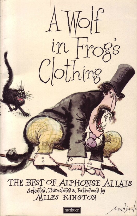
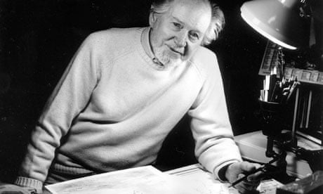
who has died aged 91, will always be associated with St Trinian's, the anarchic girls' boarding school he created in pen and ink in the 1940s, which inspired a long-running series of films. Searle and St Trinian's go together like Petruchio and Kate; except that Searle created his own shrews and lived with their reputation for the rest of his life.

Before he left for second world war service, during which he would be held captive in Changi jail, Singapore, Searle posted off several cartoons to Kaye Webb, the assistant editor of Lilliput magazine. One of them showed a group of schoolgirls clutching hockey sticks gathered around a noticeboard; the caption read: "Owing to the international situation, the match with St Trinian's has been postponed." This is only obliquely about St Trinian's, but is always known as the first in the genre and has some of the characteristics of the mature version: flesh showing between the girls' black stockings and tunic, specs, pigtails, pointy noses. Searle thought no more about it until he picked up a tattered copy of Lilliput on a street in Singapore as the Japanese were invading and found his cartoon in it.

The first full-blown St Trinian's cartoon in Lilliput came after his release from Changi and was based on a real school (now defunct), St Trinnean's, in Edinburgh, which Searle had heard of when he was posted to Scotland during the phoney war. Much later, he turned down an invitation to stand for rector of Edinburgh University because, he said, he had done enough damage already to the city's academic reputation.

Searle was born in Cambridge, the son of a railwayman. He left full-time education at Cambridge central school at the age of 14 and started work as an office boy with a firm of solicitors. Doodling on legal documents proved a retrograde career move; Searle was sacked, but his new job packing boxes at the Co-op brought a handsome advance in salary with which he was able to pay for evening classes at Cambridge School of Art. Later, he won a scholarship and became a full-time student. He was 15 when the cartoonist of what was then the Cambridge Daily News left for Fleet Street, and Searle immediately sent in some drawings on spec; the editor was taken with the boy's talent and took a cartoon a week from him at half a guinea a time.

Advertisement were much better than the average evening newspaper cartoon, quite edgy about local politics and its pomposities, but there was nothing to suggest Searle's blazing graphic talent. In the April before the war broke out, Searle, who by now added commissions from the university magazine Granta to his growing experience, joined the Territorial Army.

Called to the colours with the Royal Engineers on the outbreak of hostilities in 1939, he spent a relatively relaxed period in Norfolk as a camouflage artist and then Kirkcudbright before embarking on a troopship to an undisclosed destination. The voyage took the Engineers, including Sapper Searle, filling sketchpads all the way in an already totally mature graphic style, to ports of call in Cape Town, Mombasa and the Chagos Islands in the Indian Ocean. Finally it became clear that they were bound for Singapore. They arrived just as General Yamashita's Japanese army came pouring down out of the Malayan jungle and across the straits to Singapore island. With calm obliviousness to his situation, Searle drew the new imperial conquerors even as they arrived in tanks, armoured trucks and cars, and on motorbikes and sidecars. It was the start of an astonishing enterprise.

From Changi, Searle embarked with other PoWs on a forced march to work on the death railway in Siam (now Thailand). He suffered variously beri beri, dysentery, ulcerated skin, and repeated bouts of malaria not much helped by a Japanese guard who drove a nail attached to a pickaxe handle into his body. A fellow PoW, the Australian writer Russell Braddon, remarked that they would only have known that Searle was dead if he had stopped drawing. "If you can imagine something that weighs six stone or so, is on the point of death and has no qualities of the human condition that are not revolting," Braddon wrote, "calmly lying there with a pencil and a scrap of paper, drawing, you have some idea of the difference of temperament that this man had from the ordinary human being."

The sketchbooks Searle brought home from Changi constitute a remarkable document of survival in the face of the grossest inhumanity and are probably the best visual record of war in the Imperial War Museum; they formed the basis for a book, To the Kwai and Back: War Drawings 1939-45 (1986). His mastery of the fine balance between description and expression was by now fully achieved. He had become, almost incidentally, one of the finest topographical artists of the century.

images-2 27-Ronald-Searle--cover-illustration-for-A-Wolf-in-Frog-s-Clothing--The-Best-of-Alphonse-Allais images-1

searle_450 Ronald_Searle_Los_Angeles-1 6595976_500

If success seemed to come easily to him after his return to Britain, no one could begrudge it. Searle had drawn the second St Trinian's cartoon in Changi ("Hands up the girl who burnt down the east wing last night"); it was published in Lilliput in 1946 and established the school as a home of little monsters, wicked as sin.

Webb was still at the magazine, and soon Searle and she married. St Trinian's became a national institution, to the point where Searle began to hate his creation. He said later that he had never drawn that many St Trinian's cartoons but that the impression was abroad that he did little else. In fact, after the popular success of the novel The Terror of St Trinian's (1952), Searle balked at producing another in the sequence and instead, with his friend Geoffrey Willans, a BBC journalist, he devised Nigel Molesworth, semi-literate antihero of Down With Skool (1953) and its sequels; the gentler humour (some said whimsical) seemed to suit Searle better and his public lapped it up.

Other magazine work followed and Punch became his bread and butter; he repaid it well by helping to move the magazine on from the 19th century with covers of controlled extravagance, such as a clever birthday tribute to Picasso in October 1954. Then there were the Lemon Hart rum advertisements dominating the hoardings.

Searle himself was on his way to becoming one of the first media stars, but success became cloying as he found himself being drawn into appearances on television shows such as This is Your Life, so he threw it all up and went to start again in France. The decision was moved along a bit by a chance meeting in Paris with a pretty divorcee, Monica Koenig, later the second Mrs Searle. This gave him the steel to leave Webb when she was away with the children one weekend.

There was an angry divorce, in 1967, which probably confirmed Searle's decision to return to Britain only for visits to his ageing parents. In France he worked for Le Figaro Littéraire, and there were constant commissions from the US, where the fine glossy magazine Holiday and Henry Luce's Life competed for his work. Life opened the way to reportage with commissions to illustrate the John F Kennedy 1960 presidential campaign and to cover the trial in 1961 in Israel of Hitler's henchman Adolf Eichmann.

And then Searle accomplished a long-held ambition, to work for the New Yorker. Some of his fans saw a decline from now on, and it is true that there was a rococo prettiness about some of his work, though its manic qualities eschewed cosiness. He graduated in the 1960s from cartoons to colour covers such as the one of a man alone on a beach with his head buried in a newspaper as a sun rises, gorgeous as a Tiffany lamp; and there were his pet cats, as pampered, avaricious, ugly and dissatisfied as their owners. This work retained to a high degree a sense of poisonous unease which was his legacy from the war, and which he had felt in danger of losing at the Punch round table.

In 2004 he was appointed CBE and in 2006 was made a chevalier of the Légion d'honneur. Monica died in July 2011; he is survived by his son John and daughter Kate from his first marriage.


Stephen Moss writes: In 2000, to mark his 80th birthday and a new Penguin anthology of his drawings, I visited Ronald Searle at his home in the gorgeous hill-top village of Tourtour in Provence. He hadn't been interviewed for years, and said most people in Britain thought he was dead or retired, even though he was still cartooning regularly for Le Monde. He disliked the insularity of Britain and rarely returned, but his house was full of carefully alphabetised videos of films and television programmes, as well as innumerable books his agent sent him, so I assumed he wanted reminders of home.

We ended up conducting the interview over two extended lunches at a nearby Michelin-starred restaurant, which he adored and where his adoration was reciprocated. We were joined at lunch by his garrulous wife Monica and Eamonn McCabe, the Guardian photographer, who had come to do the portrait for the article. I ended up with almost seven hours of tape, though Monica did about 90% of the talking.

The interview appeared in early December 2000, and a few weeks later a Christmas card arrived drawn by the great man, with Christmas and new year wishes in three languages inside, written in Searle's spidery script. He had added a PS: "Since your article appeared, both our letterbox and fax have overfloweth with enthusiastic reactions." He was surprised to find how much he was still admired and loved.

searleflying04 ronald4_1586626i searle-569x651 Ronald_Searle_Los_Angeles

Ronald Searle Photograph: Eamonn McCabe 
Tuesday 3 January 2012, The Guardian
 Ronald William Fordham Searle, artist, born 3 March 1920; died 30 December 2011


Publicité
Publicité
15 octobre 2014

Vladimir Dubossarsky and Alexander Vinogradov

happy-childhood images-3

Vladimir Dubossarsky

1964 born in Moscow

1980-1984 studied in the Moscow Art College named in memory of the 1905 revolution 

1988-1991 studied in Moscow State Art Institute named after Surikov

Corresponding member of the Academy of Arts 

Lives and works in Moscow

Alexander Vinogradov

1963 born in Moscow

1980-1984 studied in the Moscow Art College named in memory of the 1905 revolution 

1989-1995 studied in Moscow State Art Institute named after Surikov

Corresponding member of the Academy of Arts

Lives and works in Moscow

Since 1994 work together

images-5 Schermafbeelding 2013-03-08 om 07

www.dubossarskyvinogradov.com


28 août 2014

Gare Lisch: to be saved!

1623679_581497928604736_372280480_n 10662062_687457551342106_4883745270183834861_o


Exceptional building, with a mixed of Byzantine and classical style, built at the end of the 19th century. Juste Lisch his architect, who edificated la Gare Saint-Lazare and la gare des Invalides, conceived a project made of glass, metal, briques and ceramics. It was dedicated to be the quay of Le Champs de Mars for the third Universal exhibition in Paris in 1878.

 In 1889, La Gare Lisch is the closest witness of the construction of the Eiffel Tower. La Gare Lisch has been dismantled in the middle of 1897. In 1924, it became the electric station of Bois-Colombes.

Since 1985, it has been registered to  l’Inventaire Supplémentaire des Monuments Historiques. Today, La Gare Lisch is abandoned. All the projects for the relaunch of this amazing station have failed!

 Gare Lisch Gare Lisch 

www.garelisch.fr

18 novembre 2013

Paris Photo

524ede94f4165trinesondergaard_interior_34
522f246542689makita
5246e034a023chavana-1
52244b9d4f27ckerny


52414bea0eea5kd-015


L’année 2013 est une année particulièrement féconde pour Paris Photo qui a vu naître sa première édition américaine dans les studios de la Paramount à Los Angeles, où plus de 13 500 visiteurs ont afflué.

Fort de son succès international, Paris Photo continue sur cette belle lancée et accueille cette année au Grand Palais 136 galeries, dont 28 nouvelles retenues et 28 éditeurs spécialistes du livre de Photographie.

Artistes, galeristes, collectionneurs, professionnels, curieux et passionnés se retrouveront à nouveau cet automne autour d’une programmation ambitieuse et exigeante, mettant l’accent sur la diversité et la qualité des artistes et des œuvres présentées par les galeristes.

L’exposition « Collection privée » propose une découverte du rôle pionnier des collectionneurs privés qui, animés par leur passion et leur persévérance, rassemblent des œuvres maîtresses ou révèlent de nouvelles approches. Nous avons le plaisir d’accueillir une sélection d’œuvres de la collection d’Harald Falckenberg réunies autour de sa vision du médium photographique.

L’exposition « Acquisitions récentes » présente les nouvelles collections photographiques de trois institutions internationales avec, cette année : l’Instituto Moreira Salles de Rio et la photographie brésilienne liée à la transformation du paysage urbain ; l’Art Gallery of Ontario de Toronto autour d’un ensemble d’Arnaud Maggs et des pratiques photographiques ; et le Museum Folkwang d’Essen sur les représentations photographiques de l’événement historique avec un focus sur la récente crise égyptienne.

En écho à ce dernier thème, l’exposition « Livre Ouvert » présente, issu de la collection de Martin Parr, un ensemble de Protest Photo Books, pamphlets photographiques liés aux soulèvements contestataires, de la 2ème moitié du XXe siècle jusqu’à nos jours.

Enfin, Paris Photo, c’est aussi l’occasion d’un moment de convivialité, propice à la réflexion et à l’échange. Pour rendre compte de la vitalité du secteur du livre de photographie, le Prix du Livre Paris Photo sera attribué une nouvelle fois parmi une sélection de 30 ouvrages édités au cours des 15 dernières années. Tandis que les invités de la Plateforme confiée à Nicolas Bourriaud, Directeur de l’Ecole Nationale Supérieure des Beaux-Arts de Paris offriront au public conférences, entretiens, tables rondes et performances.

Cette édition riche en découvertes sera complétée par la programmation de nos partenaires officiels : Giorgio Armani et son exposition Acqua#4; J.P. Morgan avec la présentation d’une sélection d’œuvres de la JP Morgan Chase Art Collection; l’exposition de Marion Gronier produite par BMW Art et Culture; l’exposition de Cédric Gerbehaye présentée par Leica; et enfin l’exposition des Jeunes Talents SFR.

Une édition d’envergure, en attendant de vous retrouver pour Paris Photo Los Angeles du 25 au 27 Avril 2014 aux Paramount Pictures Studios.

524555954caa7caio-reisewitz-porangaba-2012-227-x-180cm-c-print-sur-diasec-ed-1-5

This has been a particularly productive year for Paris Photo, which held its first American fair in 2013 at the Paramount studios in Los Angeles, drawing a crowd of more than 13,500 visitors.

Still surfing the wave of this resounding international success, Paris Photo 2013 will be hosting 136 galleries this year at the Grand Palais (including 28 newly selected participants), and 28 publishers specializing in photography books.

Artists, galleries, collectors, professionals, enthusiasts and inquisitive minds will gather once again this fall to enjoy an ambitious, high-level program that emphasizes the diversity and quality of the artists and works presented by participating gallery owners.

The "Private Collection" exhibit introduces visitors to the pioneering role played by private collectors who, driven by their own passion and perseverance, gather masterpieces and develop new approaches. We are pleased to be hosting a selection of works from Harald Falckenberg's collection showcasing his perspective on the medium of photography.

The "Recent Acquisitions" exhibit presents the new photography collections from three international institutions. This year, it will feature the Instituto Moreira Salles from Rio, with Brazilian photography that captures transformations in the urban landscape; the Art Gallery of Ontario in Toronto, offering a set of Arnaud Maggs photographs and a series on photography practices; and the Museum Folkwang from Essen, covering photographic representations of historic events, with a focus on the recent crisis in Egypt.

Echoing that theme, the "Open Book" exhibit taken from Martin Parr's collection will present a set of Protest Photo Books, photography pamphlets covering uprisings from the second half of the 20th century to today.

Finally, Paris Photo is also a friendly forum that promotes discussion and reflection. To recognize the vitality of the photography book sector, the Paris Photo Book Awards will be given once again to winners from a selection of 30 books published over the past 15 years. Meanwhile, Nicolas Bourriaud, Director of the Ecole Nationale Supérieure des Beaux-Arts in Paris, has invited participants in the Platform to give talks, interviews, debates, and performances.

Join us for this highly-anticipated major event, followed by Paris Photo Los Angeles from April 25 to 27, 2014 at the Paramount Pictures Studios.

JULIEN FRYDMAN 
Director of Paris Photo

www.parisphoto.com

5273bca33e347sandervintage-konditormeister-fullmatt
5242fed2abfccjc_59_00
525e80e5cff31pastrycook_2007
524a8b7ce7177the_point_of_vanishing_07
522449ebd657battalai
5249abf43e367msg-gerso-00012-300
52495c1dae42801_lampmobile_lostandfound_peikwencheng


17 septembre 2013

John Stezaker at the Contemporary Art Society

Marriage_Film_Portrait_Collage_I-cropped-072Marriage_LXXIII-072_smallerMarriage_LXXVIII-072_smallerMask_65_LXV-072_smallerMask_XXXV-cropped-072_smaller

British artist John Stezaker is fascinated by the lure of images. Taking classic movie stills, vintage postcards and book illustrations, Stezaker makes collages to give old images a new meaning. By adjusting, inverting and slicing separate pictures together to create unique new works of art, Stezaker explores the subversive force of found images. Stezaker’s famous Mask series fuses the profiles of glamorous sitters with caves, hamlets, or waterfalls, making for images of eerie beauty.

His ‘Dark Star’ series turns publicity portraits into cut-out silhouettes, creating an ambiguous presence in the place of the absent celebrity. Stezaker’s way of giving old images a new context reaches its height in the found images of his Third Person Archive: the artist has removed delicate, haunting figures from the margins of obsolete travel illustrations. Presented as images on their own, they now take the centre stage of our attention

This first major exhibition of John Stezaker offers a chance to see work by an artist whose subject is the power in the act of looking itself. With over 90 works from the 1970s to today, the artist reveals the subversive force of images, reflecting on how visual language can create new meaning.

The work of British artist John Stezaker (b. 1949) engages with the ceaseless flow of images that is the consequence of popular culture, the mass media and mechanical reproduction. Instead of creating new images fromscratch, Stezaker uses existing material: classic moviestills, vintage postcards and book illustrations. By means of minimal intervention, such as cropping, excision, rotation or occlusion, the artist removes these images from their original context, and allows them to acquire new meaning. Stezaker’s emphasis on the image itself reflects his fascination in the visual:‘ I am dedicated to fascination – to image fascination, a fascination for the point at which the image becomes self-enclosed and autonomous. It does so through a series of processes of disjunction.’ The artist’s collages often add or take away visual elements. The unexpected encounter of diverse images create surprising new narratives; the precise cut-out opens up new interpretations. His found images and image fragments take such approach of re-contextualisation even further. Through simple rotation or mere cropping, the previously forgotten images acquire a renewed poetic resonance, and, in many cases, disquieting allure. (Introduction written for the Whitechapel Gallery for his exhibition in March 2011).

The_Story_IV-cropped-072Imposter-IV-300Imposter-V-300Imposter-VIII-300Pair_IV-072_smaller__


23 mai 2013

L'Affichiste in Montreal: an amazing boutique dedicated to Posters

A real playdoyer from a fervent collectionneur

  patedent_5_large_medium cachou-lajaunie_large_medium Cappiello_Charbon_Chimique_39 meunier_savon_Starlight196_modifie-1_large_medium bal-des-etudiants-lafon-vintage-poster_1_medium

When I began collecting posters almost 25 years ago, the only thing I knew about them was that they appealed to me visually. Posters are instinctive: one needn’t have any art history background or even a particular field of interest in order to appreciate the beauty and soul evident in each and every vintage poster. Because I was interested, I have learned a great deal about how posters developed, who designed and printed them, and how they came to be regarded (and collected) as some of the most interesting ephemera ever produced.

Since opening L’Affichiste almost six years ago, I have worked with collectors and dealers from around the world, have consulted with museums and foundations, and have worked hard to create not just a gallery for the posters which I love, but also a space and a site where one can learn about posters in the same way I have: by discovering that they are unique, remarkable and collectible pieces of history.

Any website which proclaims to sell authentic vintage posters can give you a great deal of information about how posters evolved and the processes and influences which were important to their development. Many of these sites do a fine job of giving you all the information you could ever want to have about great poster artists like Jules Cheret, Henri de Toulouse Lautrec, Alphons Mucha and Leonetto Cappiello, as well as heaps of data on poster history, design, values, etc. 

What follows is a concise, and completely personal reduction of 25 years of knowledge, encapsulated and highlighted by some of the posters I love, items available for sale through this site and at the L’Affichiste gallery in Montreal. 

POSTER + PRINTING: Printing presses facilitated further development, but early posters were originally limited to text – imagine the WANTED posters in old cowboy movies – formulated from what were called letter-presses. Gradual development allowed the introduction of images or sketches into these posters. The earliest color broadsides – posters incorporating color and letter-press text - were charmingly primitive, and give us a great understanding of how quickly advertisers and artists realized the growing importance and power of posters. The possibilities were endless: circus posters, theater posters, posters for travelling road shows … it seemed there was no limit to the types of advertisers and marketers who grasped the visual power and potential of posters. 

Cheret_enfant-prodigue_87_5_x_33_25_in_modifie-1_large_medium cheret-musee-grevin_large_medium P1090606_medium P1090665_medium P1090578_medium P1090586_medium 

JULES CHERET: Which brings us, in the most roundabout, and perhaps not sufficiently respectful way, to a man named Jules Cheret. Any poster dealer, collector, website or reference book will tell you that Jules Cheret is the ‘father of the poster’: the man who single-handedly managed to transform the French lithographic process from a fairly mundane and moribund thing into a lively, colorful and exuberant examination of theater and fashion. Without belaboring the technical details, Cheret looked at what had been previously accomplished lithographically, and moved it forward stratospherically - he may have been the first artist to realize that while the size of presses might be limited, there was no real reason not to glue two posters together to create one which was twice as large as anything which had previously been thought possible. With two-sheet posters, and later four-and-more sheet posters appearing on the kiosks and sidings of Paris (and most other metropolitan cities in Europe) poster artists were suddenly able to have paper canvases that might just be large enough for their imaginations. 

While Cheret is credited with technically advancing the poster, Henri de Toulouse Lautrec, a contemporary of Cheret’s, was responsible for giving the French poster of the late 1890’s and early 1900’s life and élan. Lautrec’s posters – some of them so scandalous they were censored – showed a completely different Paris than those of Cheret: while Cheret was very decorous, Lautrec was risqué and had a great love of the seedier side of life: prostitutes, cabaret artists and sexual deviants of every size and type were subjects of choice. Lautrec was perhaps the first to realize that sex sells – and with clients like the Moulin Rouge cabaret, which featured dancers who wore nothing under their petticoats – Lautrec had lots of material to work with.

The established Parisian printing house of Chaix, boldly noticing the French ‘postermania’, began issuing a collection called the Maitres de L’Affiche: a subscription series of collection posters which Chaix printed in miniature, thereby giving the poster-loving public the opportunity to own their own small scale version of what Chaix called the most important posters of the world at the time. The Maitres collection is fairly egalitarian – included in the collection are artists from England, Belgium, America, and other countries – but as the advances in the lithographic process really was credited to Cheret, (and as Chaix was, after all, a French firm), it was the French poster artists who were best represented in the Maitres de L’Affiche collection.

 cousine_1_medium biscuits-lu_1_medium centennaire-folies-bergeres-darnel_1_medium cinzanino_red-maquette_1_medium etoile-dor_1_medium


ART NOUVEAU/BELLE EPOQUE: At roughly the same time as Lautrec was getting to know the underbelly of Paris – and enjoying it – a wonderful and prodigiously talented Czech artist named Alphons Mucha was falling in love with the beauty of the female form in an entirely different way. Mucha’s Belle Epoque woman was much more coy in her seductiveness, much less brash and brassy. Mucha was prolific and had no trouble producing commercial art – for companies like LU biscuits, while concurrently creating decorative panels.

ART DECO: Art Nouveau was all sinuous lines and florals – pretty women doing pretty things in environments that could make your mouth water. What followed – the Art Deco period (roughly 1920-1940) was almost at the other end of the spectrum graphically: strong colors, bold lines, messages which were – for the most part – impactful and important. Deco would not have been possible without Nouveau, and the gallery glamorizes both periods with equal emphasis. 

So many of the classic poster artists who are considered to be THE most collectible worked during the 1920’s and 30’s: Cassandre, Carlu, Cappiello… Each had a style which Each had a style which was unique and almost instantly recognizable: Cassandre was a graphic master, Carlu (who overcame the loss of an eye at an early age) created innumerable images which are still considered classics, and Cappiello… well, Cappiello is the ne plus ultra of poster design and a marketer par excellence. His Maurin Quina poster, his Nil, his Cachou Lajaunie, Veuve Amiot - any poster dealer worth their salt will have these in their galleries and their homes. 

Art Deco pieces are exceptional value in terms of their design impact and their investment value: the first large piece I bought when I started collecting was Cappiello’s Nitrolian – it is now worth roughly 4 times what I paid for it about 20 years ago. 

MID CENTURY MODERN + CONTEMPORARY POSTERS: When I opened the gallery I was stuck very much in the Art Nouveau-Art Deco periods. To me, if a poster wasn’t made within that short window of time – 1890-1940 – it wasn’t vintage, wasn’t important, and certainly wasn’t worth selling. Boy, was I wrong. 

Transportation, which was always a big end-user of posters for publicity purposes, created great posters in the period of 1950-1970s. Sabena, the national Belgian airline, commissioned some lovely posters – we have a pair which we love, and Air France, always a power-house when it came to using posters as an advertising medium, in 1968 hired Georges Mattieu to design a series of 14 posters – each featuring a destination to which Air France flew – that are as much of a departure from Art Nouveau and Art Deco as possible. They are unusual, they are stupendous, and they are so very different from anything I thought I would buy or sell – I’m glad to say they opened my eyes to poster design of a completely different nature. 

algerian-independence-poster_large_medium chinese-tobacco_large_medium P1120381_large_medium P1120385_large_medium gaufrettes-pralines-lefevre-utile_large_large Mucha-juin_large_medium


Whether posters are from China during the cultural revolution, Quebec during the so-called Quiet Revolution, or from Algeria during its own revolutionary period every poster from every age reflects the social, political, economic and artistic realities of its time. How are Poster prices determined?

PRICING: The most common question (after ‘how can you tell a poster is authentic, and vintage?’) would be “How are poster prices determined?” To this, I would have to say that there are four basic factors which determine price: 

How rare the poster is – Does every poster dealer have a copy of this poster or is it an uncommon print? If it’s rare, it is more likely to be more expensive than a typical, even classic vintage poster. 

Who designed the poster – Clearly a Cappiello will (generally) command Cappiello-like prices. Most posters by anonymous artists (there are exceptions, of course) are less likely to be as expensive as those by artists designated as ‘masters’. 

Condition – All of L’Affichiste’s posters are in excellent or very good (A, A-, B+, B) condition. I cant sell what I wouldn’t buy and I am meticulous in my condition reports – it is has a flaw I will let you know. Market – As Montreal is a smaller market than say, New York or Chicago, I simply can not ask the same prices as other dealers in those markets. Some of the posters I sell are being sold for twice as much elsewhere – the same poster, produced at the same time, by the same artist and printed by the same printer. These are just the facts of the marketplace – it always makes sense to shop around… but I am fairly confident in my prices. 

There is so much more to be said about posters – I am happy to answer any questions, send more photos – but when I started writing this I wanted to make it brief…. it’s not brief, but I think it covers the basic and gives you a clear idea of who I am, what I think, and some of the posters we sell at L’Affichiste.

www.laffichiste.com

Publicité
Publicité
1 2 3 4 5 6 > >>
Archives
Publicité
Publicité